I kept watching someone make manuals in Google Slides

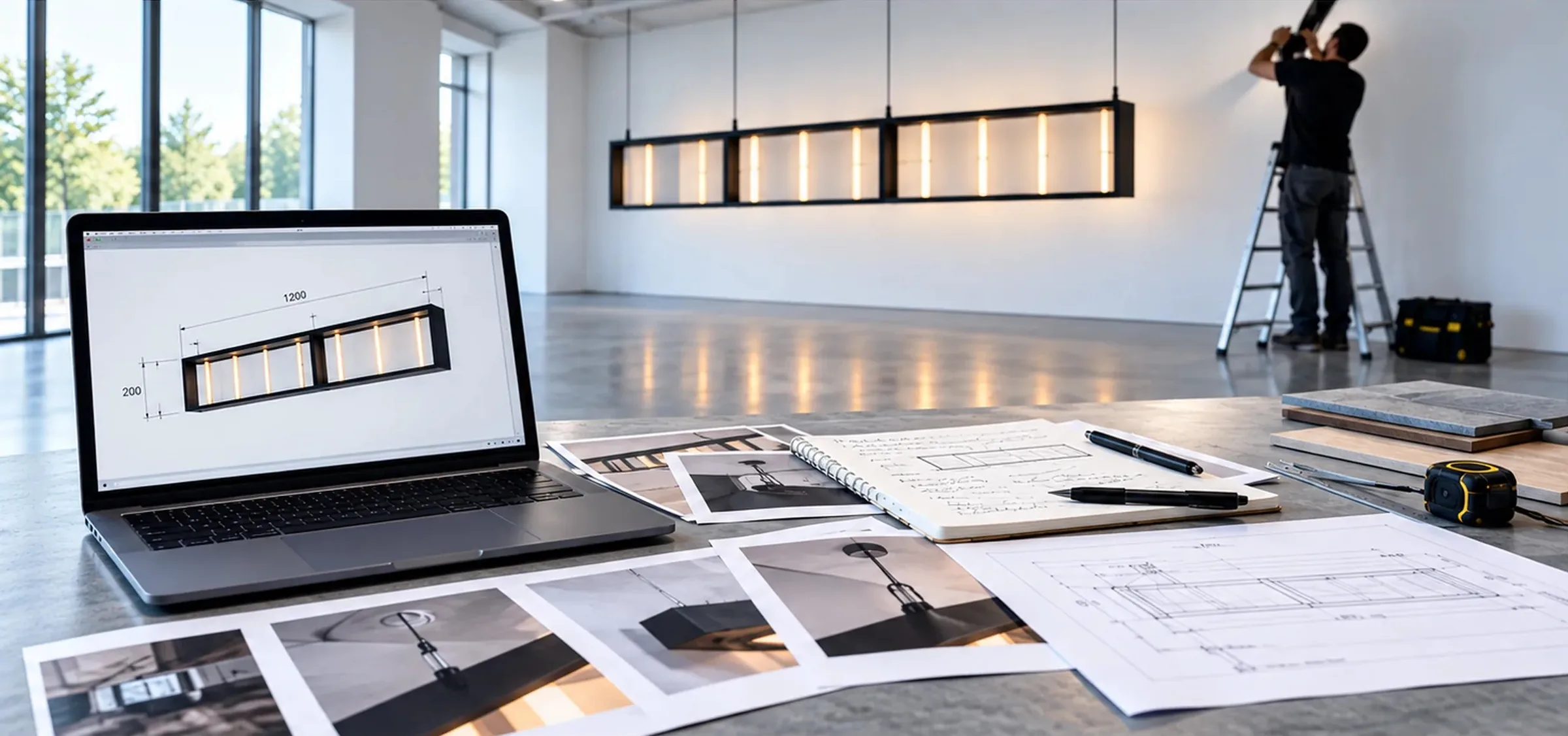
I had originally been brought into an artist’s studio to redesign the physical workspace. The next part of the job became looking at how the studio worked, and one of the things that stood out was how much time the assistant spent making installation manuals.
She would take screenshots from SketchUp, collect whatever technical information she had, open Google Slides and start assembling the document. Then came the image placement, labels, spacing, page changes and repeated checking that somebody outside the studio would actually understand what they were looking at.
A manual could stretch across two or three working days. Not because the writing itself took that long. Most of the time was going into organising the material and getting the document into a professional state.
It seemed like a good place to start.
MG 01

The information is different every time

These are manuals for physical artworks that have to be installed by museums, galleries, technicians and external installation teams.
One project might come with good drawings and dimensions. Another has photographs, a material list, notes from a previous installation and something important that somebody remembers from a conversation. Sometimes useful information is visible in an image but has never been written down anywhere.
So the difficult part was not generating paragraphs. The system had to understand what information mattered for this particular artwork, how the installation should be explained and what was still unknown.
It also had to be careful. If the suspension detail is missing, it cannot invent a convincing suspension detail because the sentence reads better that way.
MG 02

Missing information became part of the workflow

That became one of the basic rules of the first version.
The system could interpret the information it had, organise it and identify gaps. If something important was missing, it had to ask rather than silently fill it in.
I treated that as a product state. A project could be ready to generate, or it could be waiting for information.
That sounds fairly obvious now, but it affected a lot of the architecture. Technical uncertainty could not just disappear somewhere inside an AI response.
MG 03

The first version did not look like AI

There was another constraint at the time. The assistant who was supposed to make the manuals was very resistant to AI and did not want to work directly with it.
So I designed around that.
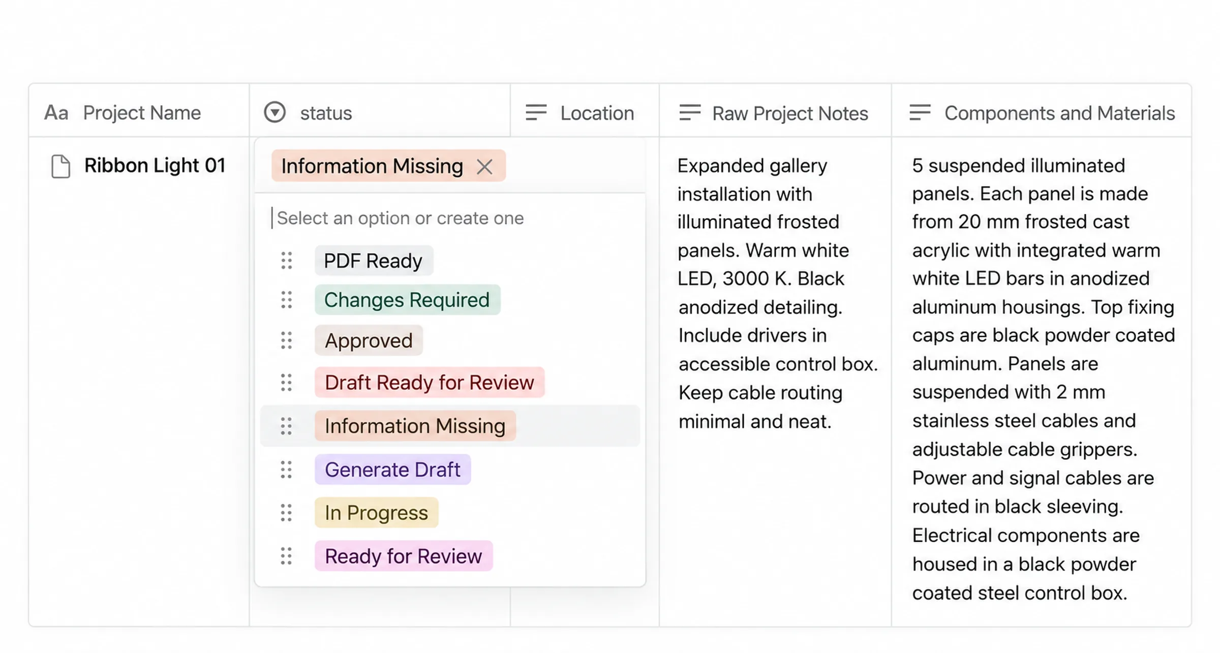
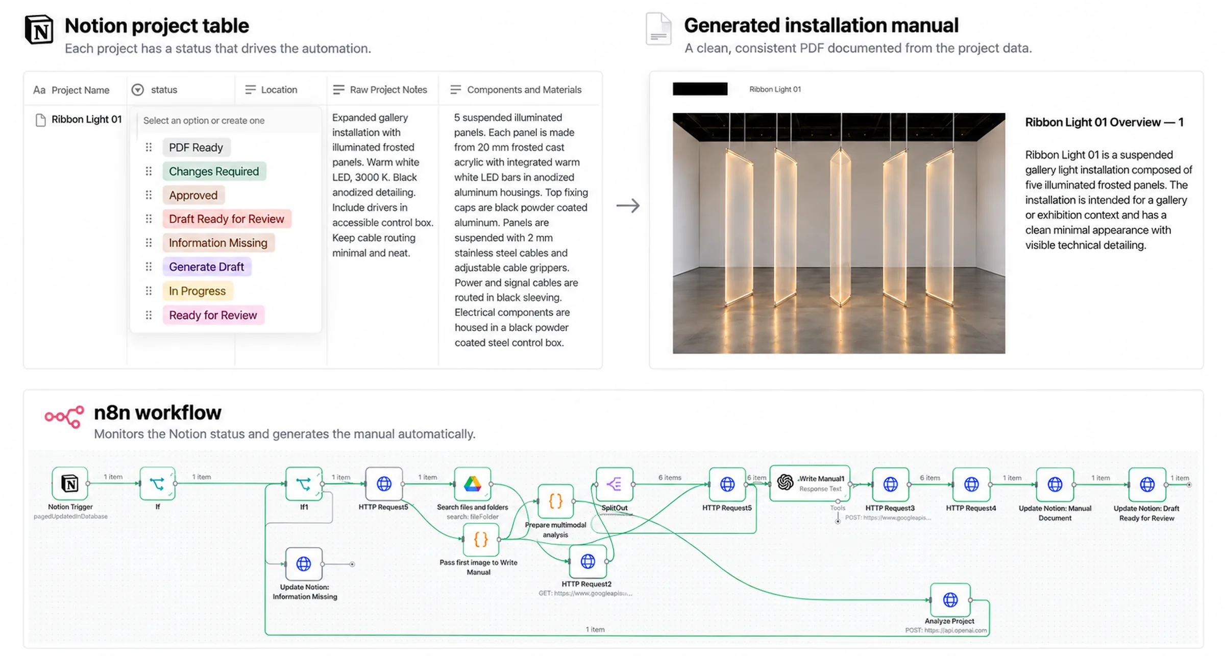
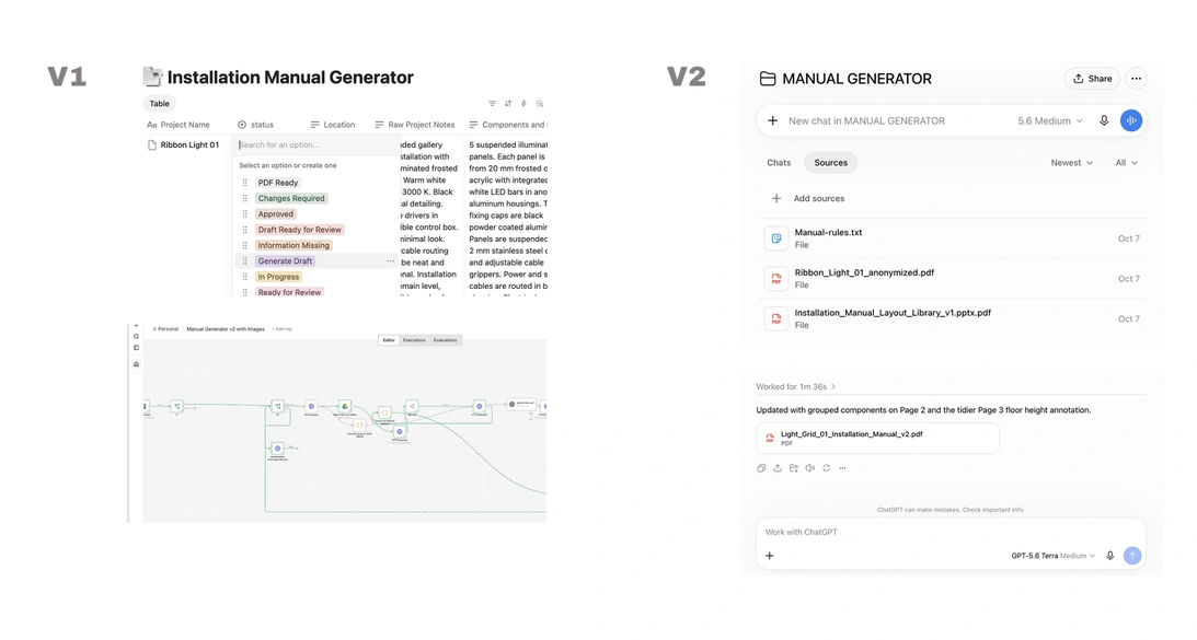
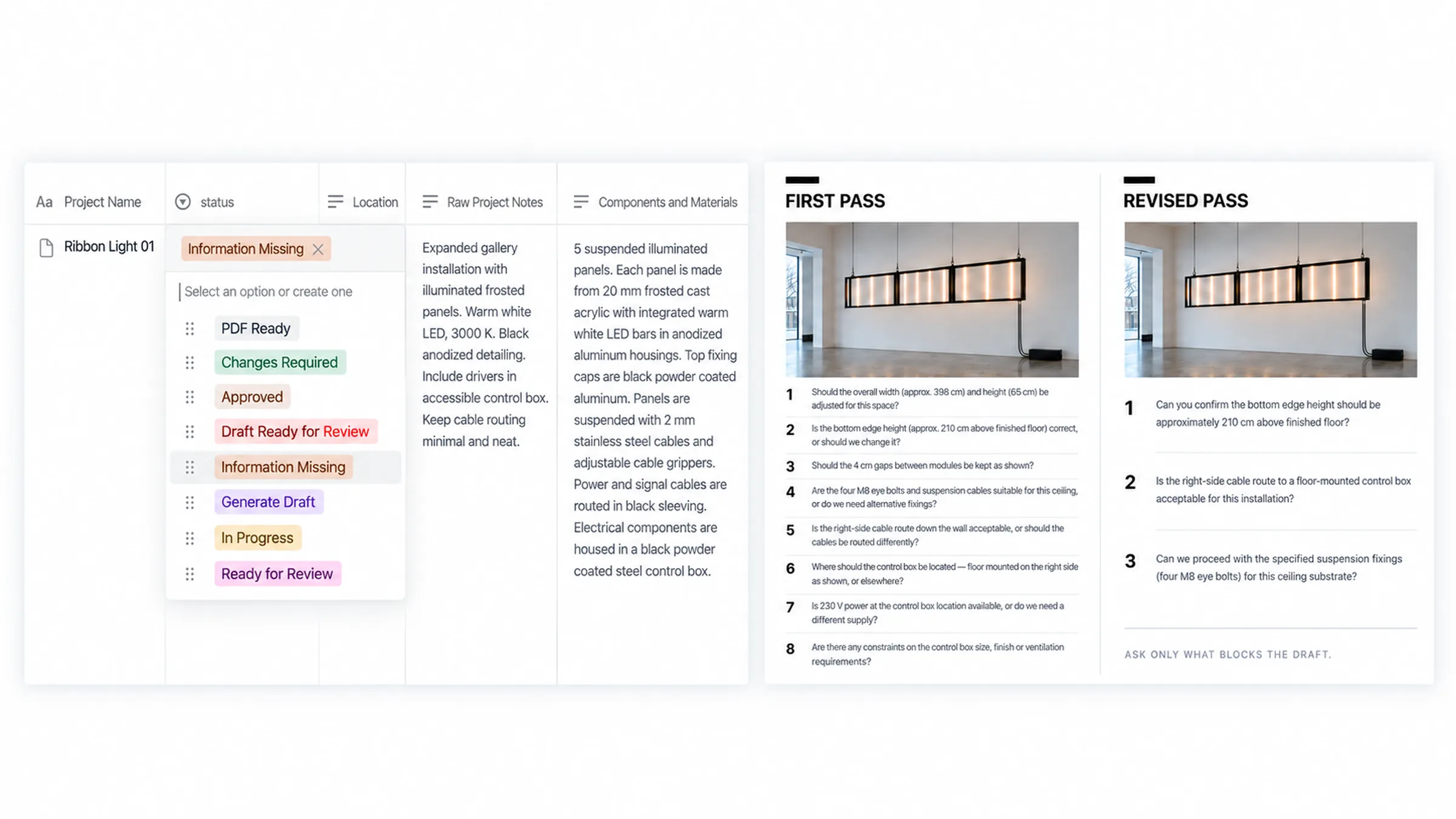
Notion became the interface. She could enter the project name, location, notes, components, dimensions, setup instructions and safety information there. When she changed the status to Generate Draft, the rest happened behind the scenes.
I used n8n to run the workflow, Google Drive for the project material, OpenAI to analyse the information and Google Slides to build the manual.
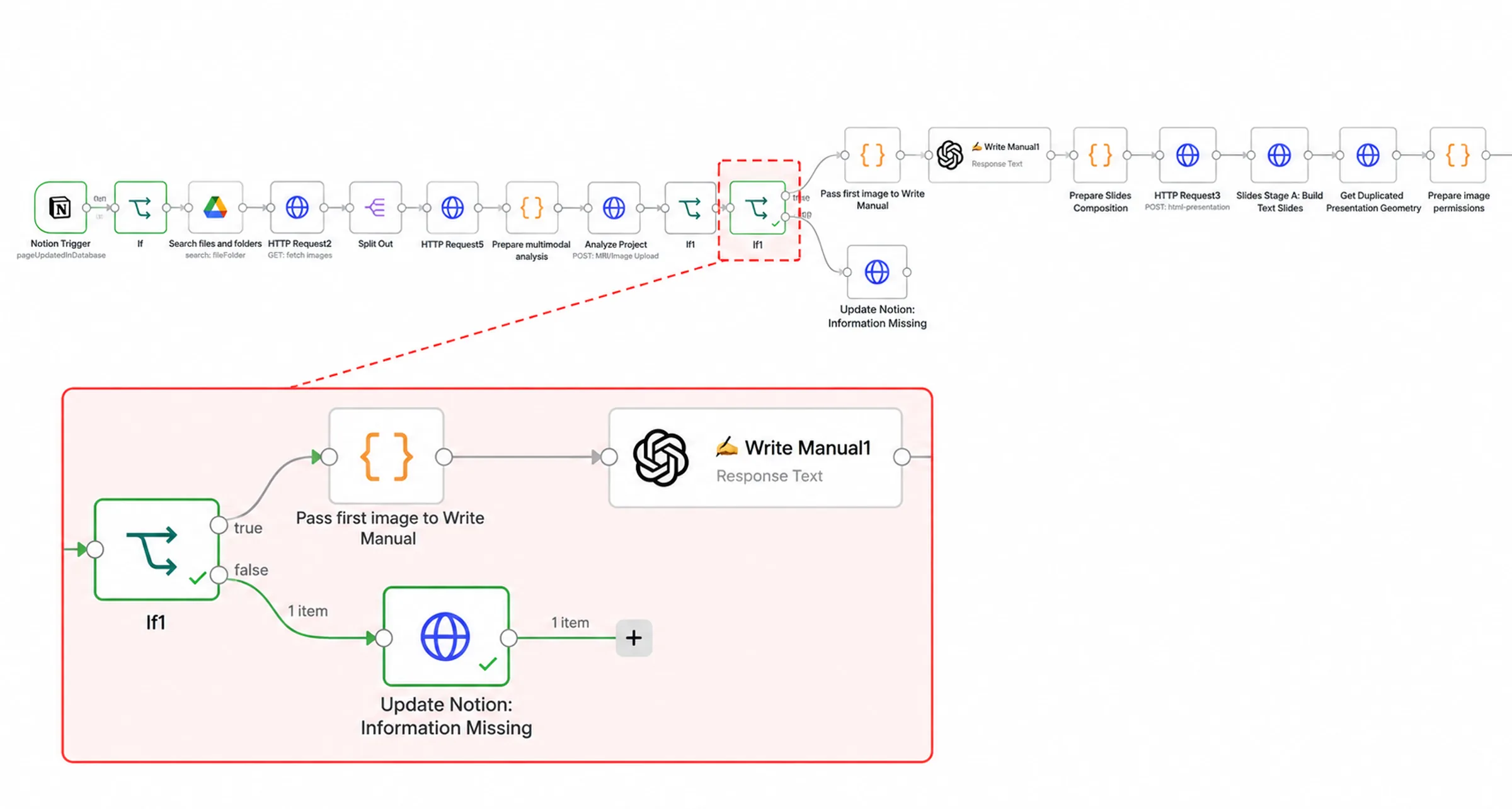
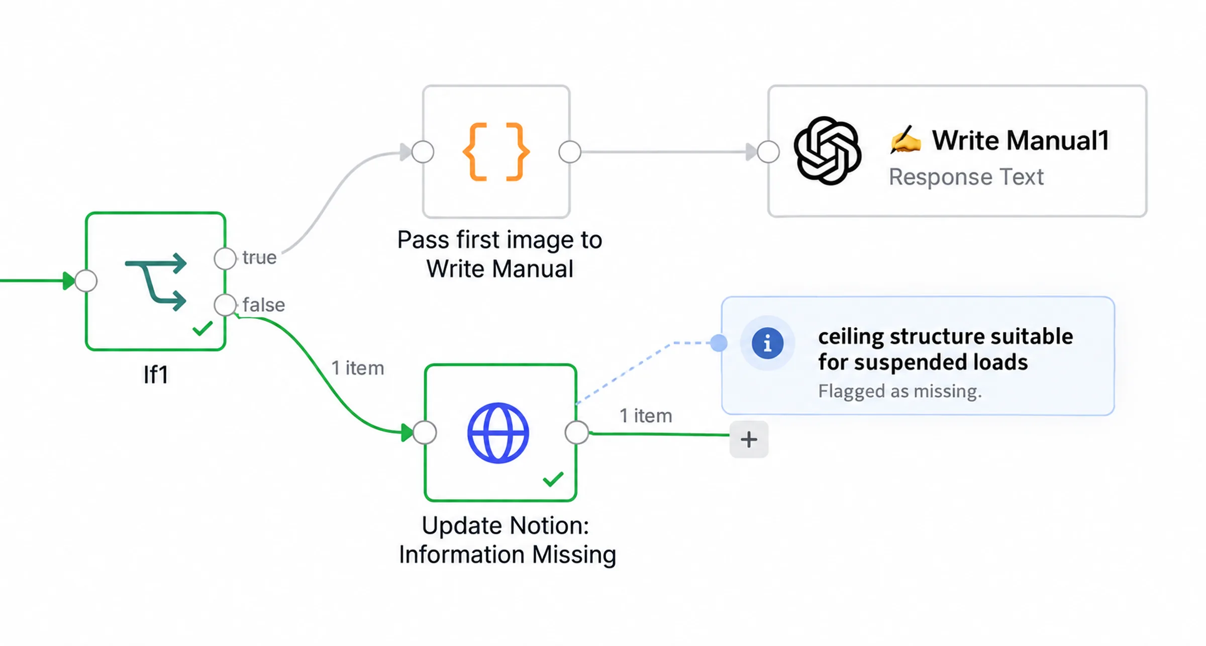
The system checked whether it had enough information before it continued. If something important was missing, it changed the status to Information Missing and wrote the questions back into Notion. If the project was complete enough, it generated the draft and moved it to Ready for Review.
It was more complicated than having a conversation with ChatGPT. At that point that was part of the design, not an accident.
MG 04

Images were information too

One thing I wanted from the beginning was for the system to look at the images rather than treating them as decoration.
A photograph might show the overall installation, a suspension connection or where the control box sits. A SketchUp image might explain the relationship between components much better than a paragraph could.
The workflow pulled the project images from Drive and analysed them together with the written information. It could use that to decide which sections belonged in the manual, put the installation steps into a sensible order and choose images for the document.
That part worked surprisingly well.
It also meant the assistant was no longer starting with an empty Slides file and trying to remember how the previous manual had been put together.
MG 05

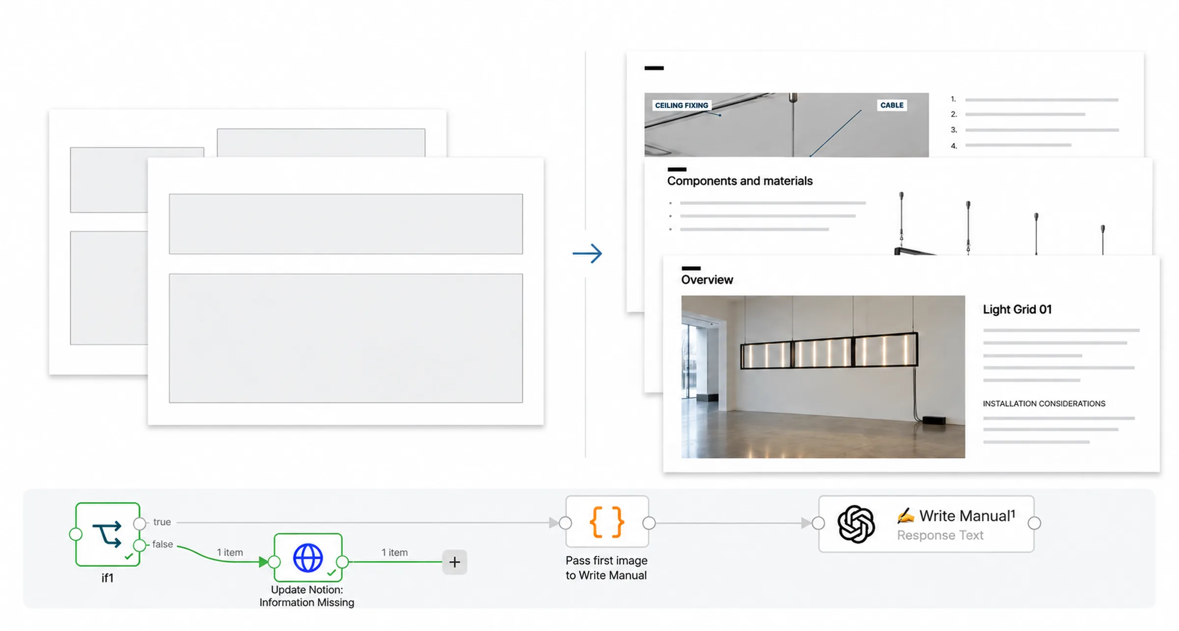
I ended up with sixteen slide layouts

The visual side became less elegant.
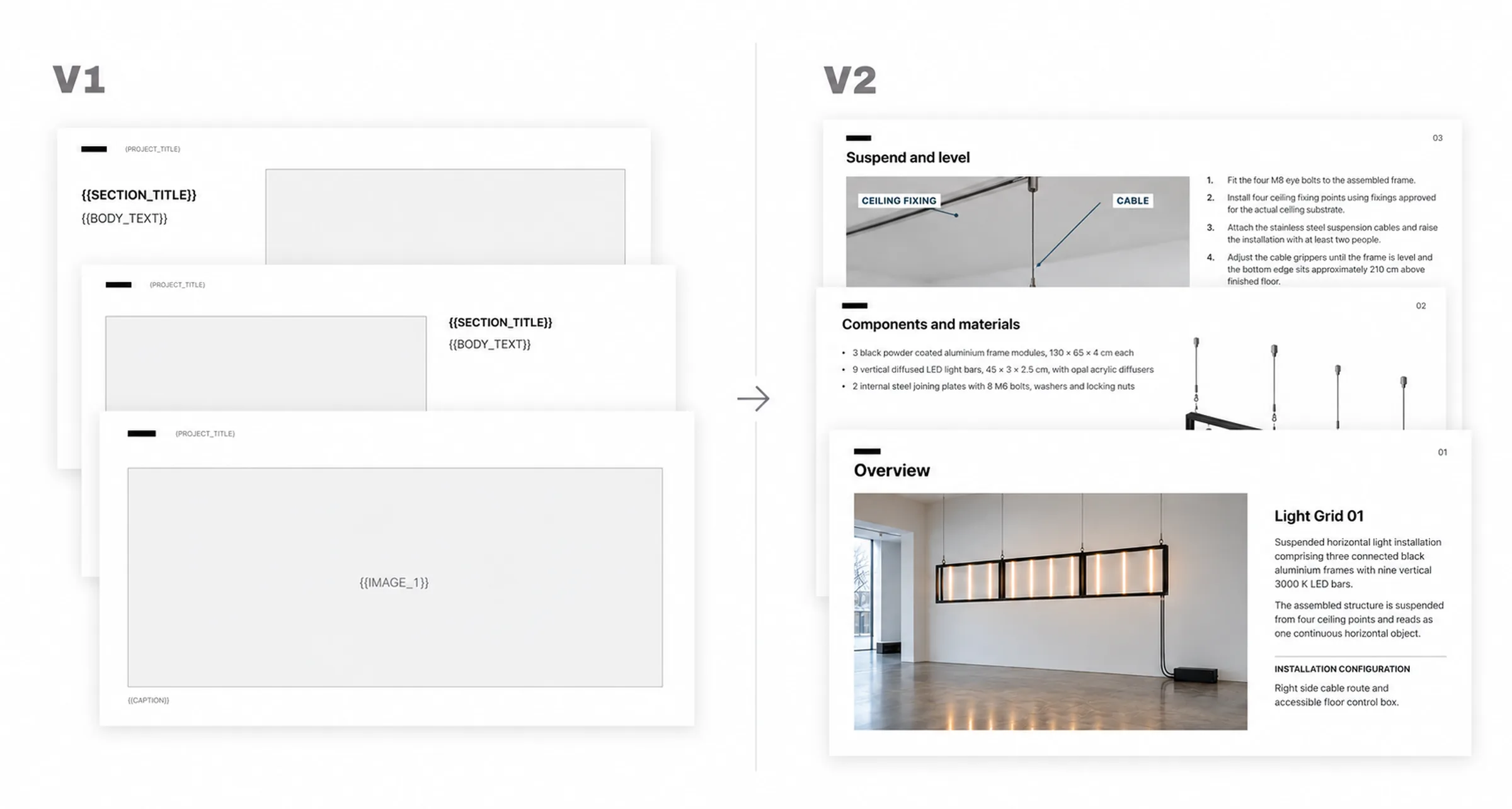
I used Google Slides as the layout engine and created a library of templates with placeholders for text, images, captions and project information. As I tried to make the system more flexible, the template library kept growing.
Eventually there were roughly sixteen slide layouts.
When I looked at them properly later, most were variations of about four useful page types.
A cover. An image with explanatory text. A page with text, a warning and a supporting image. An image with a caption.
I had added more templates to give the system options. In practice I had mostly given it more dependencies.
MG 06

Then I came back after a few weeks

V1 worked during testing. It could analyse a project, ask for missing information, retrieve the images, structure the manual and build a reviewable document.
Then I stopped working on it for a while.
When I came back, some of the Google authentication had expired and the workflow had stopped working. I reconnected it and it ran again, but that was the point where I started looking at the system differently.
I knew what the credentials were. I knew why Drive was disconnected, where the Slides IDs came from and what had to be fixed in n8n.
The assistant would not have known any of that.
I had built something that worked, but it depended too much on the person who had built it continuing to understand all the plumbing underneath.
I did not want to be the technician in the basement forever.
MG 07

I was also making the validation too clever

I had become increasingly strict about validation because I did not want technical information to be invented.
The validator checked actions, prerequisites, sequence, states, image evidence and other relationships in the installation instructions. The idea was sensible. The model became too rigid.
At one point something like “ceiling structure suitable for suspended loads” could cause a problem because the system interpreted it as a condition that should have been created by an earlier installation action.
It was beginning to check whether the manual satisfied its own abstract model rather than whether the manual was useful and safe.
That was a useful distinction.
I still wanted the system to stop when something genuinely important was missing. I did not need it to prove every sentence through an elaborate internal schema.
MG 08

In the meantime she had started using AI

The other thing that changed had nothing to do with the architecture.
The assistant became much more comfortable with AI. Other people in the studio were using it, she saw useful results and the resistance that had shaped V1 was no longer really there.
That removed the main reason for hiding the AI behind Notion and automation.
I could have rebuilt the same system with cleaner integrations. Instead I went back to the workflow itself.
The first version had automated the process I inherited. The second version started from what the assistant actually needed to accomplish.
MG 09

The second version starts with the project

V2 lives inside a ChatGPT Project. Each artwork gets its own conversation.
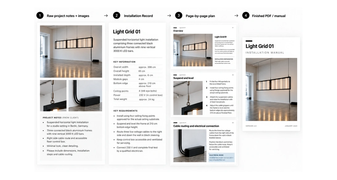
The assistant can upload whatever exists: SketchUp screenshots, photographs, renders, notes, dimensions, material information and installation instructions. The system first works through that material and creates an Installation Record.
That record is the shared version of what is known about the project. It can include the components, dimensions, site requirements, installation sequence, technical information, safety information and anything that is still unclear.
Then the system decides whether it needs to ask anything before continuing.
It does not force every artwork into the same manual structure. A suspended lighting installation and a floor sculpture have different installation problems, so they can have different sections and different numbers of pages.
Once the information is sufficiently clear, it proposes the page structure and the images it wants to use. The assistant can correct that before the PDF is made.
MG 10

The first version of that conversation was too demanding

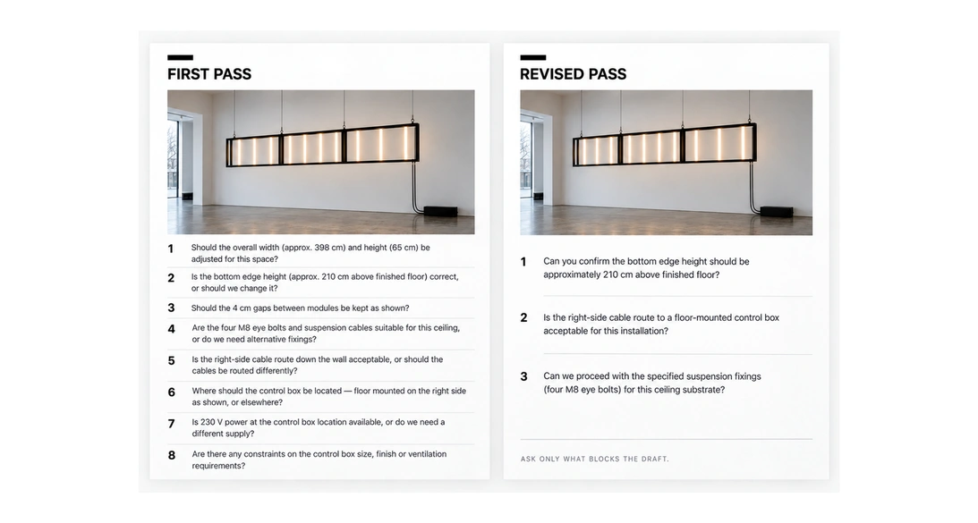
When I tested V2, the system initially came back with a long list of technically sensible questions.
It was thorough. It was also annoying.
I had removed a complicated form and accidentally replaced it with a conversation that gave the user homework.
So I changed the rules.
The system now asks only the few questions that matter enough to block progress. Usually that means two to five. If something can safely remain unresolved until the installer is on site, it can use neutral wording or leave a placeholder instead of forcing the assistant to research it immediately.
The point is to reduce the amount of work around making the manual, not to move that work into a chat window.
MG 11

I changed how it uses images too

V1 could understand images, but the document generation still inherited some of the logic of the slide templates. If a layout had an image position, there was a tendency to put an image there.
In V2 every image needs to explain something.
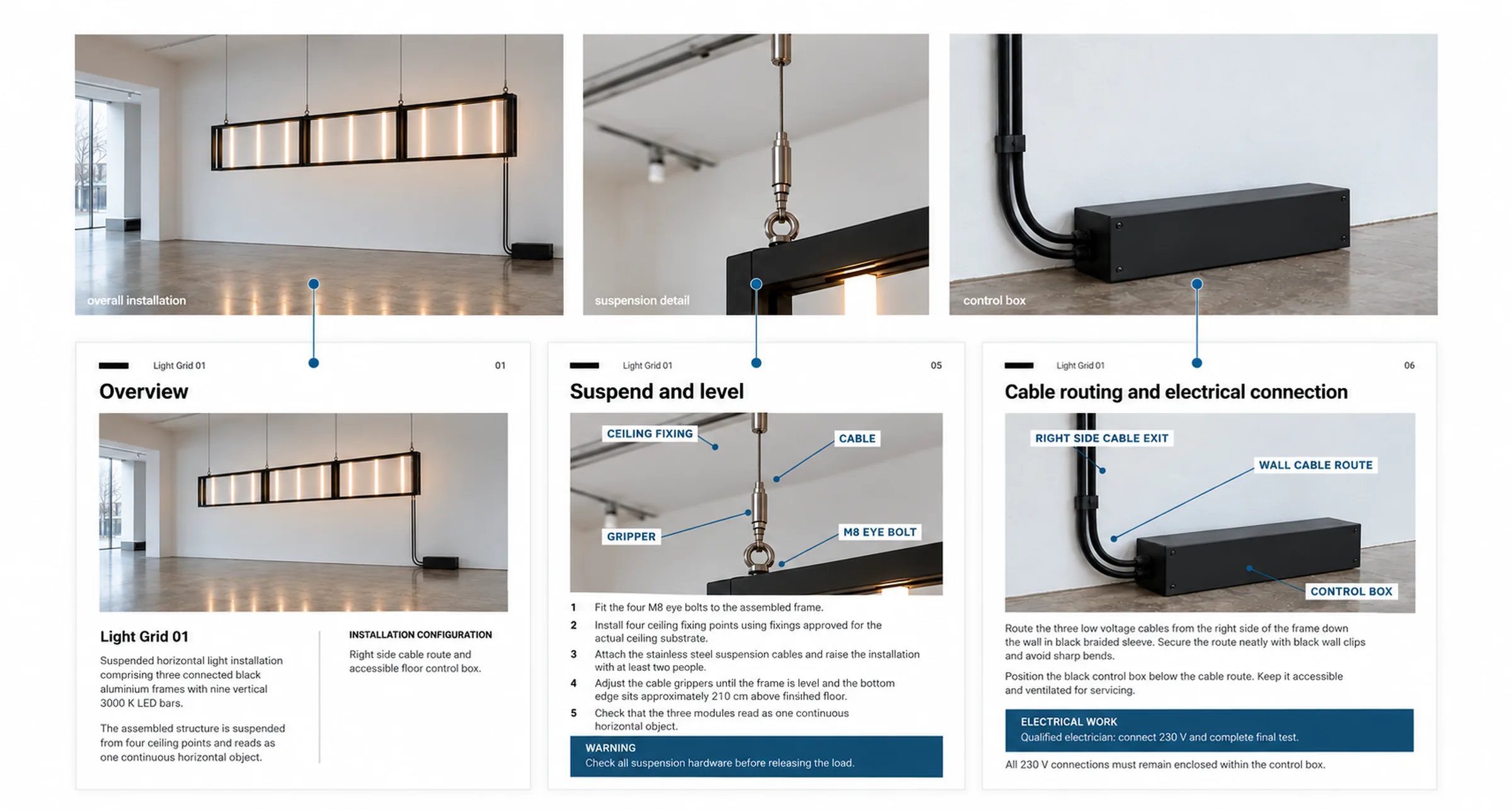
If the useful detail already exists inside a larger photograph, the system can crop it. If the image would be clearer with an arrow, label or measurement, it can annotate it. If none of the available images show something important, it can ask for another angle.
It can also leave a page without an image.
That became important because repeating the same installation photograph on several pages made the manual feel generated, even when the information itself was good.
MG 12

I tested it with Light Grid

Light Grid 01 was useful because it was not the project I had used as the permanent reference example inside the system.
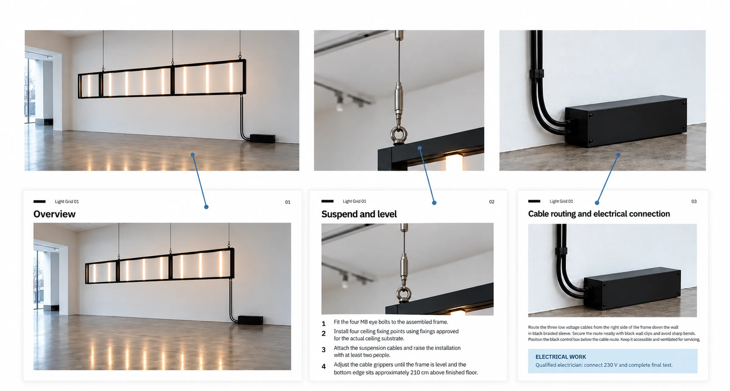
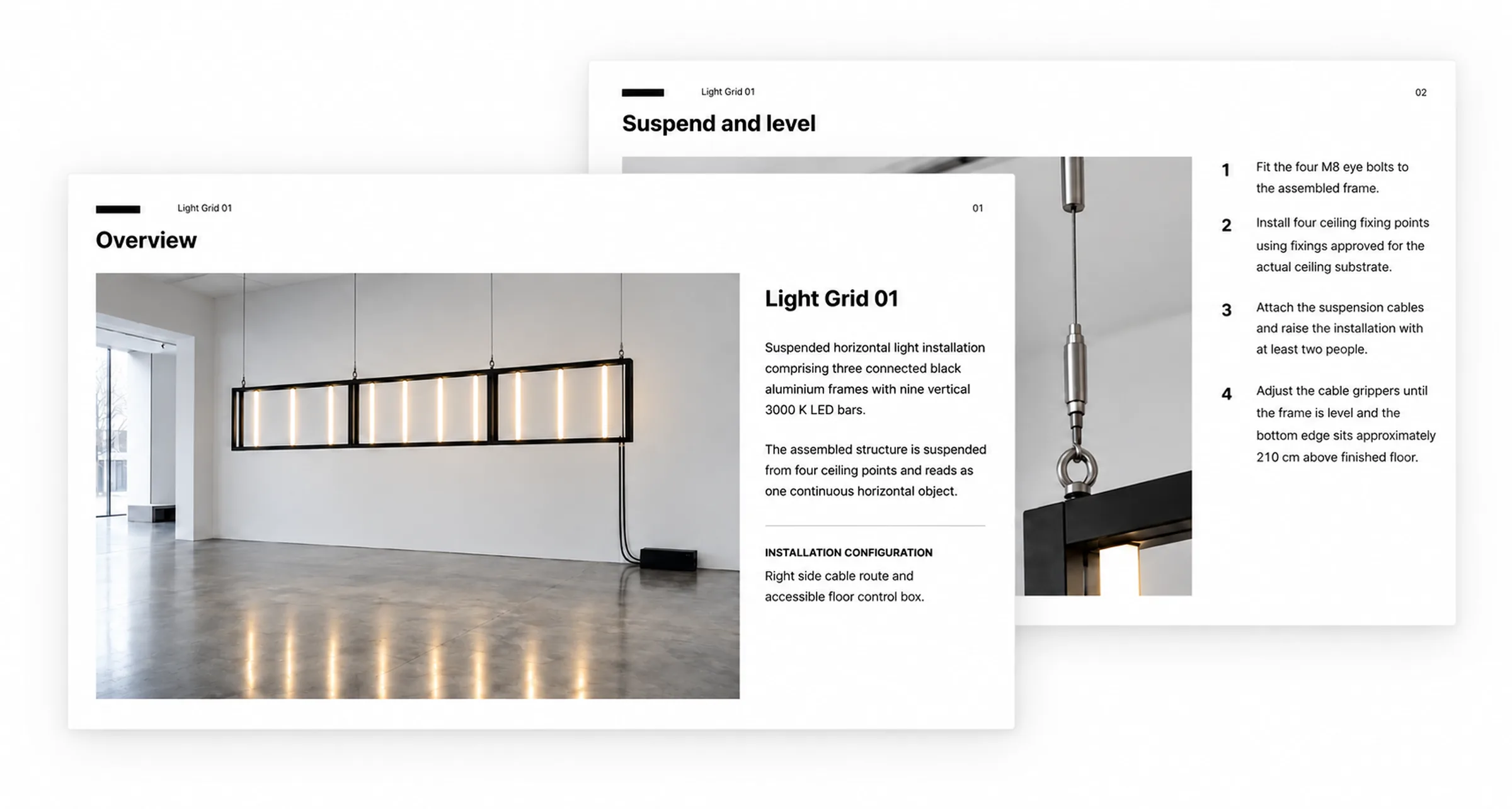
It is a suspended lighting installation made from three connected black aluminium frames with nine vertical light bars. I gave V2 the project notes, materials, dimensions, installation instructions, safety information and the image set.
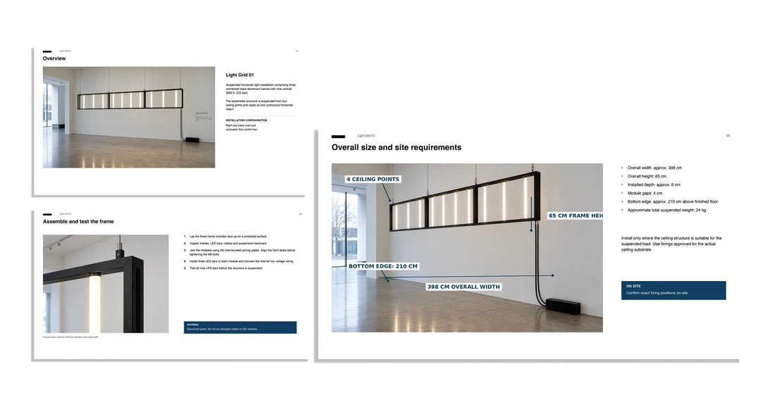
It created the Installation Record and proposed a seven page manual.
The pages covered the overview, components and materials, overall dimensions and site requirements, assembly and testing, suspension and levelling, cable routing and electrical connection, and final checks.
For the dimensions page it used an angled installation image and marked the overall width, frame height, suspension points and installation height.
For the suspension page it used a close crop and labelled the ceiling fixing, cable, gripper and eye bolt. For the electrical section it cropped the right side of the installation to show the cable exit, route down the wall and control box.
The final checks page was text only because another installation photograph was not adding anything.
I corrected some image repetition in the first output and changed a few annotation and spacing decisions. The next version was noticeably better.
That was the point where it started to feel less like a system filling templates and more like a system making decisions about the document.
MG 13

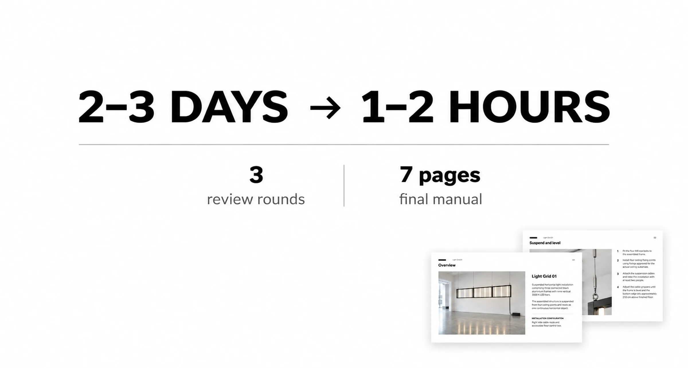
Two or three days became one or two hours

The configured Light Grid test took around ten minutes and three review rounds to produce the seven page manual.
I do not think ten minutes is the useful number. The test information was already collected and prepared.
In a real studio workflow, the assistant still has to gather the images and project information, talk through anything unclear, review the proposed pages and check the finished PDF.
I would expect that process to take one or two hours instead of stretching across two or three working days.
The part I wanted to remove was not the human judgment. It was the repeated formatting, restructuring and document assembly around it.
MG 14

What I would keep human

There are things I would add if the system became a permanent studio tool. It could reuse confirmed information from previous installations, connect more directly to the project archive and keep better version history. Some projects could also benefit from a more explicit technical signoff before a manual is released.
I would not try to remove the final human review.
The system can decide how to organise the material. It can find gaps, suggest structure, choose useful images and build the document.
The person making the manual still has to decide whether the technical information is true.
That boundary is part of the design.
MG 15

The second version is much smaller

The visual comparison between the two versions is almost comical.
V1 is a large n8n workflow connected to Notion, Drive, Slides and several layers of validation. V2 is mostly the project information, a conversation and a review step.
I do not think that means building V1 was a mistake. It showed me which decisions AI could help with, where the dangerous uncertainty was and which parts of the workflow became brittle when I tried to formalise them too much.
What changed was my idea of what needed to be automated.
The first version was built around making the document automatically.
The second is built around making the decisions around the document easier.
MG 16